

2026-09-08 · 5 min
A logo is not a brand. Here is the difference.
The mark is the handshake. The identity is how you show up after that - on a site, a reel, a pack and a quote.
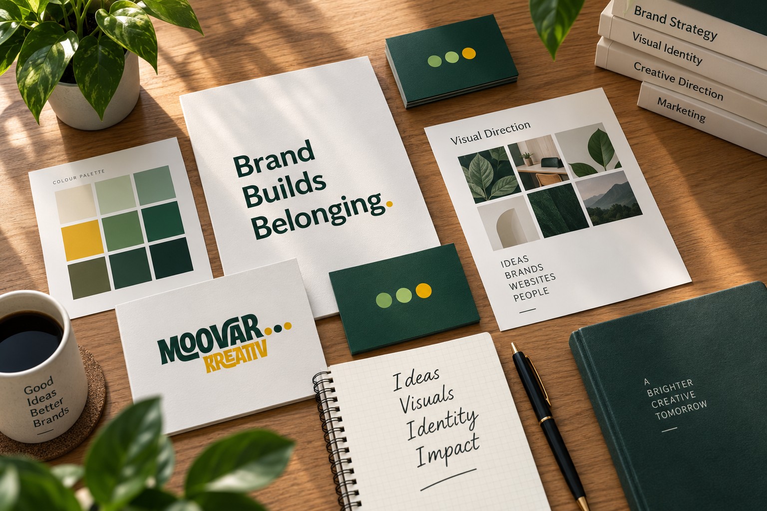
The mark does one job
A logo should be recognisable at a glance, at a small size, in one colour. It should not try to tell the entire story. Moovar’s own mark uses three dots - three minds, infinite continuation - because a simple idea scales.
Identity is the system around it
Colours, type, space, tone of voice, how photography feels, how a caption is written. When those are decided, a junior designer - or the business owner - can make a story, a visiting card or a packaging label without inventing a new look each time.
For a small business this can be lean: a primary and secondary colour, one display type, one body type, a few layout rules, and examples. That is a brand kit. That is enough to start.
What we actually deliver
Logo files in the right formats, colour and type specs, social templates, and guidelines written in plain language. No theatre. The work should be usable on Monday morning.
Written by Moovar Kreativ, Tamil Nadu. Start a project.